
October 16, 2018
It’s unfortunately very easy to make a complicated website - particularly if you take the DIY approach or employ the wrong web design company.
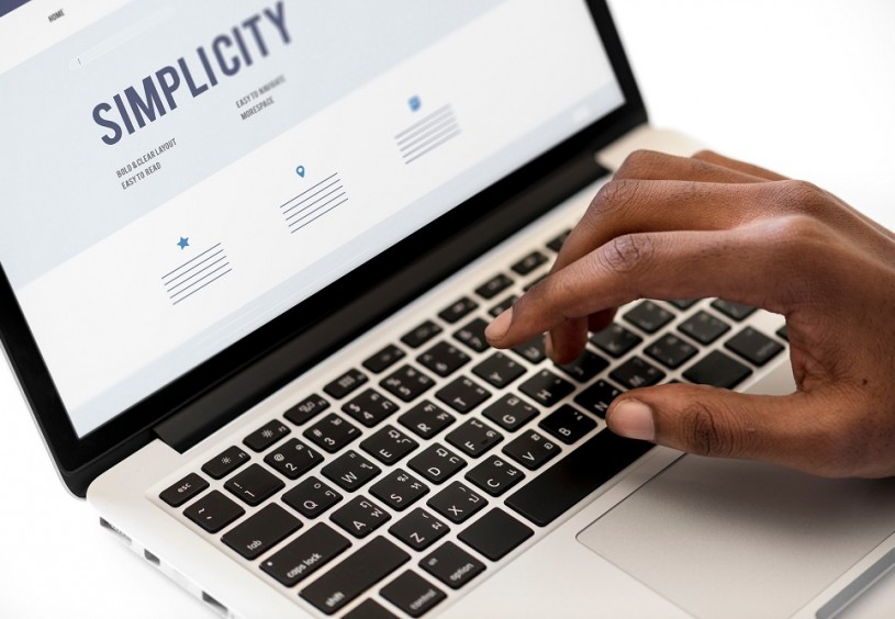
The truth about web design is that it’s actually incredibly hard to make a simple website. It’s why great web designers and developers exist and are in such high demand.
Like everything in life, the simplest ideas are always the most effective. It’s just the process of devising and implementing them that should be left to the experts!
If you’re running a business and you’ve somehow commissioned a needlessly complicated website, it will be turning away more potential business than it’s attracting.
It’s why your sales inbox is so dry. It’s why the phone isn’t ringing off the hook. It’s why, whenever you say “have you heard of us” to someone in your industry, they say “no”.
Simple websites work for three very - you guessed it - simple reasons:
What do you want people who visit your website to do? That’s right - spend their money on your products and services! And, with a simple customer journey, they’ll do just that.
The simple stuff in life makes us happy. When something ‘just works’, or a process you assumed might be complicated is anything but, it puts a smile on your face. You want to put a smile on the face of your website’s visitors, don’t you?
If your website is over-complicated, visitors will spend more time thinking about how to use it than they will about your brand and why your product might benefit them. If it’s simple, the opposite is true!
Keep It Simple, Stupid (KISS) is a phrase the best web designers on the planet live by, and for good reason.
Clearly, employing a great web designer is what you need to do if you want your website to do a brilliant job for your business, but it’s handy to have some knowledge of how to apply the KISS principle to website design.
So, here’s what it consists of:
White space is your friend in web design. The more of it that exists on each webpage, the more the user’s eyes will be drawn to what matters.
Your website can’t succeed without bright, bold imagery that encourages people to explore the content within. If you can, always invest in original photography and graphics, too.
How do you want visitors to the site to ultimately finish their journey? Contact you? Buy something? Download a report? Whatever it is, make the call-to-action totally unmissable.
Use ‘About Us’, not ‘Our Clan’.
Enough said.
Just… don’t. It might be tempting to install Google Adsense on your website, but unless you’re trying to monetise a blog, your business website really doesn’t need ads cluttering up each page.
The important stuff above the fold
This is an ancient newspaper industry term, but is still relevant in web design. Everything you want people to see immediately should be viewable without any form of scrolling, pinching-to-zoom or squinting.
Only give visitors to your site one method of purchase. The less choices people have to do something significant, the less time they’ll spend making a decision.
Finally, it’s vitally important that every website is fully user tested before being declared ‘KISS-ified’.
Make sure yours is trialled by a cross section of users (different age groups, genders and nationalities), and gather their feedback. Keep refining until every ounce of complication is removed!