
April 21, 2026
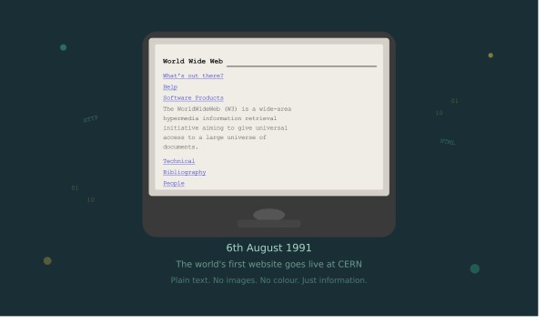
Cast your mind back to 6th August 1991. Tim Berners-Lee, a British scientist working at CERN in Switzerland, published the very first website on the World Wide Web. There were no images, no colours, no logos, and certainly no animations. Just plain black text on a white background, with a few clickable hyperlinks. It explained what the World Wide Web was and how to use it.
Fast forward to today, and websites are immersive, intelligent, fully responsive digital experiences — capable of adapting to the device you're using, learning from your behaviour, and delivering content in real time. The journey from that first humble page to what we build now is one of the most remarkable evolutions in modern technology.
Here at Newedge, we've been designing and building websites since 2005, so we've lived through much of this evolution firsthand. Let's take a walk through the history of web design and development — and look at just how far we've come.
The first websites were purely functional. Built entirely in HTML (HyperText Markup Language), they existed to share information — academic papers, technical documentation, basic directories. There was no concept of "design" as we know it today. Everything was text-based, left-aligned, and entirely unstyled.
The browser wars of the mid-1990s — primarily between Netscape Navigator and Internet Explorer — began to push things forward. Developers started experimenting with basic formatting: different font sizes, bold text, and the first primitive use of images. It was rough around the edges, but it planted the seed of what was to come.
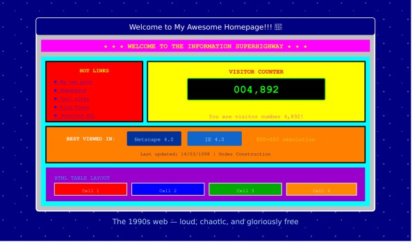
By the mid-to-late 1990s, designers had discovered a clever workaround for layout: HTML tables. Originally intended to display data in rows and columns, tables were repurposed to position elements on a page — creating the illusion of a structured layout.
This era also brought us the animated GIF, gaudy background colours, visitor counters, and marquee scrolling text. If you were online in 1997, you'll know exactly what we mean. Websites were loud, chaotic, and often genuinely difficult to read — but they were also exciting. The web felt like the Wild West, and everyone was staking their claim.
It was also during this period that JavaScript emerged, bringing basic interactivity — dropdown menus, form validation, and simple animations — to web pages for the first time.
The early 2000s saw two major developments that would shape web design for years to come.
The first was Adobe Flash. For a time, Flash was everywhere — delivering rich animations, interactive games, and video content that static HTML simply couldn't match. Elaborate intro animations, cursor effects, and fully animated websites became a hallmark of the era. But Flash had a serious weakness: it was terrible for search engines, inaccessible to screen readers, and — as we'd eventually discover — a significant security risk. When Apple famously refused to support Flash on the iPhone in 2007, its fate was sealed.
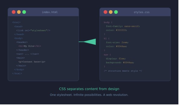
The second, and far more lasting development, was the widespread adoption of CSS (Cascading Style Sheets). CSS allowed designers to separate the visual presentation of a website from its underlying code for the first time. This was a genuine revolution. Suddenly, you could change the look of an entire website by editing a single stylesheet — and pages became faster, cleaner, and much easier to maintain.
It was also during this period that the concept of "web standards" took hold, championed by organisations like the W3C (World Wide Web Consortium). The web was growing up.
As the web became more central to business and everyday life, a new challenge emerged: how do you let non-technical people update their own websites?
The answer was the Content Management System (CMS). Platforms like WordPress (launched 2003), Joomla, and Drupal put the power of publishing into the hands of business owners, marketers, and writers — without needing to touch a line of code. At Newedge, we've long worked with SilverStripe CMS, a powerful, flexible, and secure platform that gives our clients full control over their content without compromising on quality or performance.
This era also gave us Web 2.0 — a shift from static, read-only websites to dynamic, interactive platforms. Social media began to emerge. User-generated content became the norm. Websites were no longer just digital brochures; they were living, breathing platforms.
Design-wise, the trend moved towards cleaner layouts, more considered typography, and a more professional aesthetic. Drop shadows, gradients, and glossy buttons were in vogue — a style often referred to as "skeuomorphic" design, where digital elements were made to mimic their real-world counterparts.
If there's one development that fundamentally changed web design more than any other in recent history, it's the smartphone.
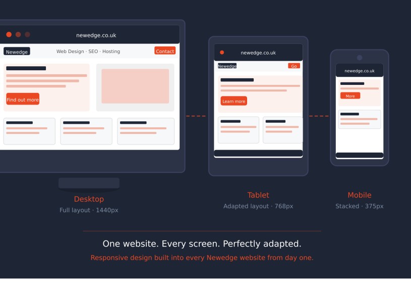
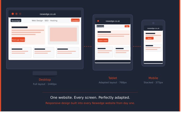
When Apple launched the iPhone in 2007 and the App Store in 2008, internet browsing shifted dramatically away from desktop computers. By the early 2010s, it was clear that designing only for desktop screens was no longer acceptable. Enter responsive web design.
Coined by designer Ethan Marcotte in 2010, responsive design meant that a single website could automatically adapt its layout to suit any screen size — whether a widescreen monitor, a tablet, or a mobile phone. This was a monumental shift, and it changed the way developers and designers approached every single project.
Google cemented this change in 2015 when it began penalising websites that weren't mobile-friendly in its search rankings. If your website didn't work on a phone, you were falling behind — in both user experience and SEO. At Newedge, mobile optimisation has been a cornerstone of everything we build, and today every site we deliver is fully responsive from the ground up.
The 2010s also saw the rise of flat design — a move away from the skeuomorphic style of the 2000s toward clean, minimalist interfaces with simple shapes, bold colours, and crisp typography. Apple and Google both embraced this approach, and it quickly became the dominant visual language of the web.
As competition on the web intensified, simply having a good-looking website was no longer enough. Attention turned to User Experience (UX) — the science of understanding how people actually use websites, and designing around their real behaviours and needs.
UX brought with it concepts like user journey mapping, A/B testing, heatmaps, and conversion rate optimisation (CRO). Suddenly, the question wasn't just "does it look good?" but "does it actually work? Does it turn visitors into customers?"
Accessibility also came firmly into focus. Designing for all users — including those with visual impairments, motor difficulties, or cognitive differences — moved from a nice-to-have to a fundamental requirement. In the UK, the Equality Act 2010 has clear implications for website accessibility, and the WCAG (Web Content Accessibility Guidelines) have become the benchmark for inclusive design.
Performance became equally critical. Page speed — how quickly a website loads — was shown to have a direct impact on both user retention and search rankings. A delay of just a few seconds can dramatically increase the number of visitors who leave before the page even loads. Optimising images, leveraging caching, minifying code, and using Content Delivery Networks (CDNs) all became standard practice.
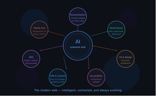
We are now firmly in an era where Artificial Intelligence is reshaping web design and development — just as every major technological shift has done before it.
AI tools are being used to assist with everything from writing website copy and generating design concepts, to analysing user behaviour and personalising content in real time. Chatbots powered by AI handle customer queries around the clock. Automated testing tools scan websites for accessibility issues, broken links, and performance bottlenecks in seconds.
At the same time, the fundamentals that have always defined a great website remain unchanged: clarity of purpose, quality of content, ease of use, and trustworthiness. Technology changes; human behaviour is more consistent than we sometimes give it credit for.
Design trends today favour bold typography, generous white space, micro-animations, and highly personalised experiences**. The best websites feel effortless — which, of course, is the result of enormous effort behind the scenes.
The web has come an extraordinary distance from that first plain-text page in 1991. And the pace of change shows no sign of slowing.
For businesses, keeping up with this evolution isn't just about staying fashionable. An outdated website can actively damage your credibility, hurt your search rankings, and cost you customers. A modern, well-built website, on the other hand, works as your most effective salesperson — 24 hours a day, seven days a week.
At Newedge, we've been navigating this ever-changing landscape since 2005. We design and build every website from scratch — no templates, no shortcuts — using the latest technologies and best practices to deliver something that truly works for your business. Whether you need a brand-new website, a redesign of an existing one, or ongoing support and SEO, we'd love to have a conversation.
Get in touch with the Newedge team today — we'd be delighted to help.